
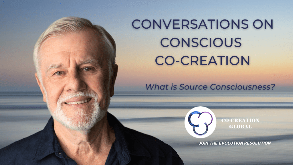
The first idea you may have for your You Tube thumbnails is to choose a picture that you like. Maybe you like this ocean sunset because it reminds you of a good memory.
But from a branding perspective, the vibration is off. And it won’t catch people’s attention. It is a bit too common. We’re too used to see this kind of image, we’ve seen it many times before so why would we stop on this while scrolling?
Also, the drop of water or the landscape do not give us any subconscious information: it could be used for almost everything so it’s not effective enough.
New creations – You Tube thumbnails
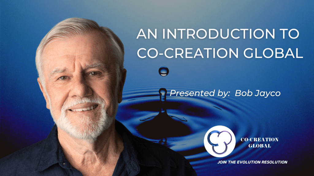
So we’ve worked to create something more attractive.
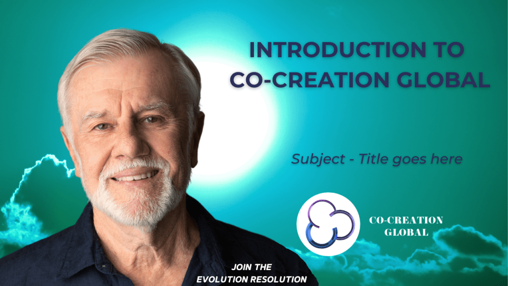
In what the client already had in store (most of the time, you already have some valuable ideas and concepts you haven’t finished to develop), I found this image that is still natural but also a bit surreal, which aligns a lot better to what this team is doing online.
Then, by playing with the lights and contrasts, we’ve realized we could make many interesting versions of it.
You want to have a stable basis for what you do. But you don’t want the same thing again and again so you need to have something that is common and recognizable on each and very piece of content you put out there while being able to make some changes.
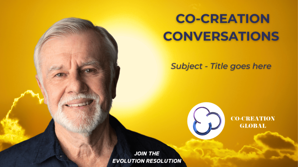
Titles & Subtitles for your YouTube Thumbnails
We have also reorganized the title and subtitle to make the messaging more attractive.
You want to avoid very common and broad terms such as “co-creation” as mentioned above because it could mean a thousand things so you need to be more precise so your tribe can recognize you.
The new title “Signals of Love” will be catchy for their target audience. People in search for spiritual content are also in search for love and messages that will answer their questions so they will be curious to click and see the video.
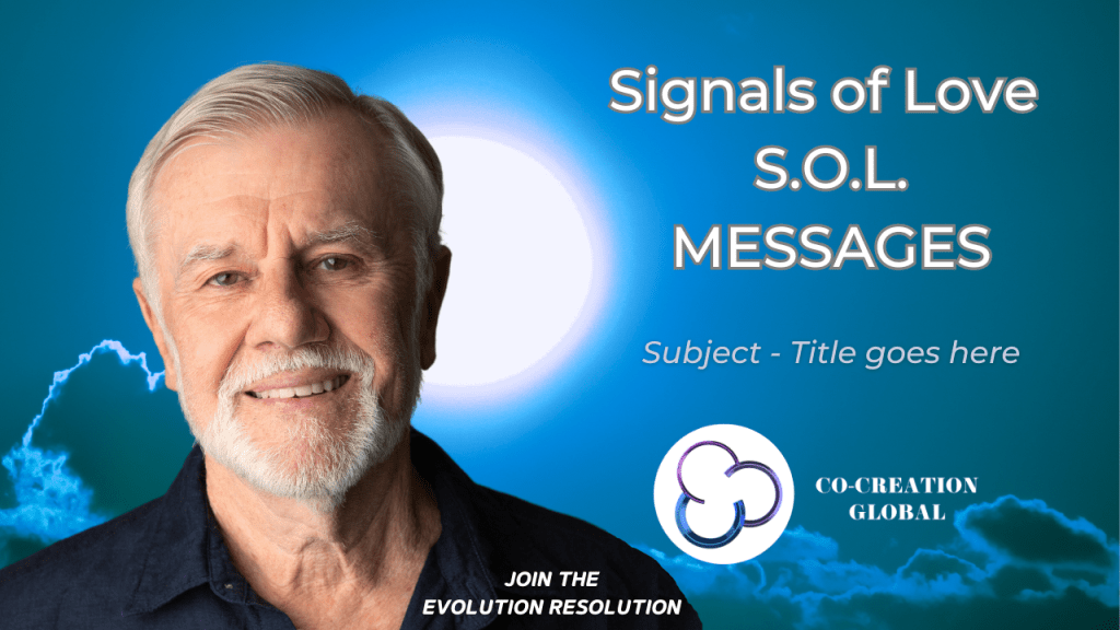
The change of colors will enable them to keep a clear visual coherence while differentiating their varied forms of content.
Last tips!
You have to work on your thumbnail from afar! Zoom out a lot to see if it works when the visuals are super small because it is the way your viewers will see it! 😉
